harbor picture company
adaptive reuse
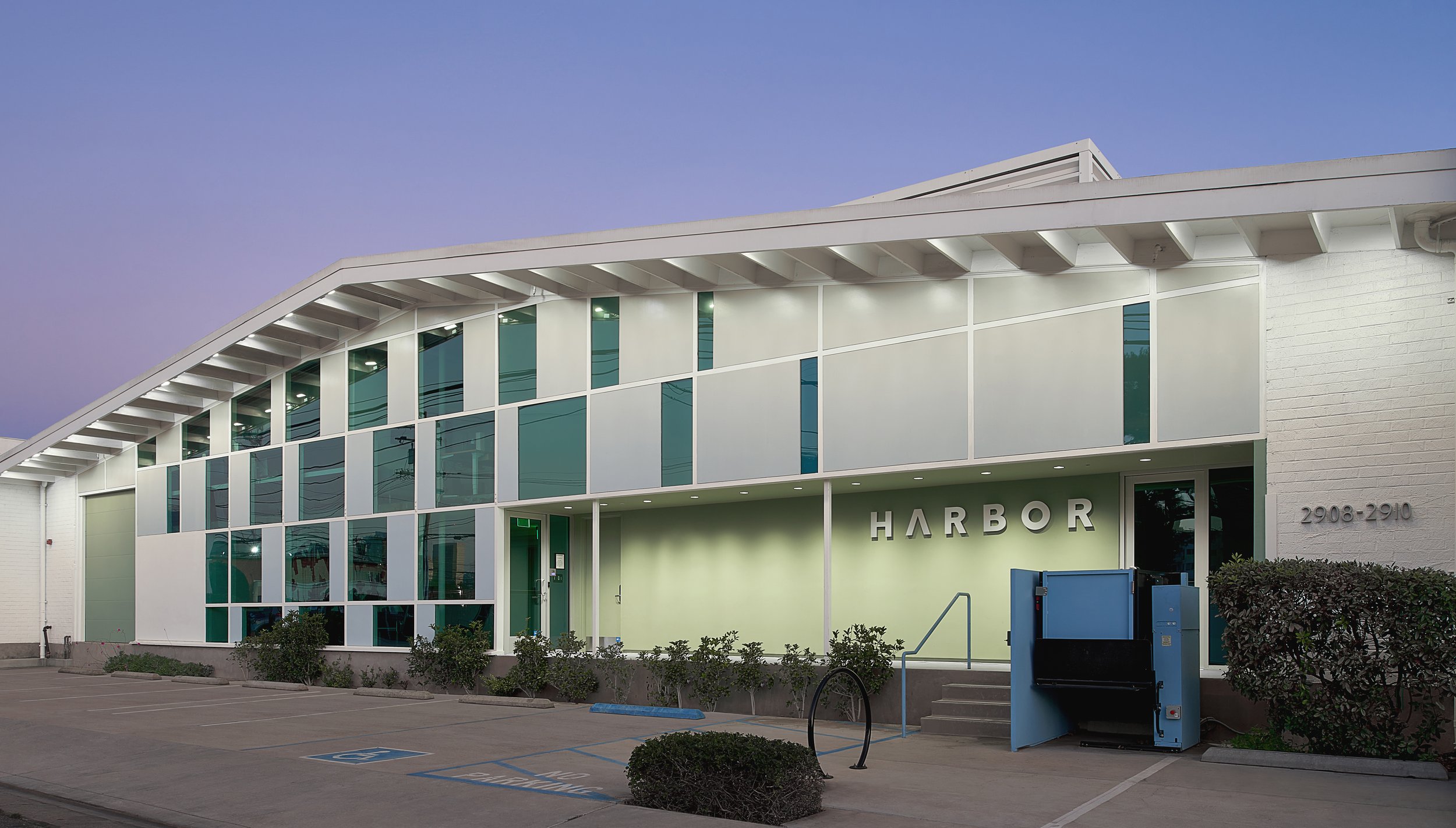
This post production company is located inside the Santa Monica Creative office building. The project’s program includes multiple theaters and smaller suites for film editing. A central open kitchen serves as a gathering place along with a smaller cozier lounge.
Photography by Izumi Tanaka & Hugh Kretschmer
Design Approach
The theaters are grouped together in the center of the building creating an “island” acoustically isolated from outside noise. It is a separate volume within the building, a box within a box, not connected to the building’s exterior wall or roof structure. The elaborately detailed wall and ceiling construction isolates each theater acoustically from one another. The state of the art theaters feature random patterns of fabric wrapped acoustical panels alluding to patterns on the building facades.
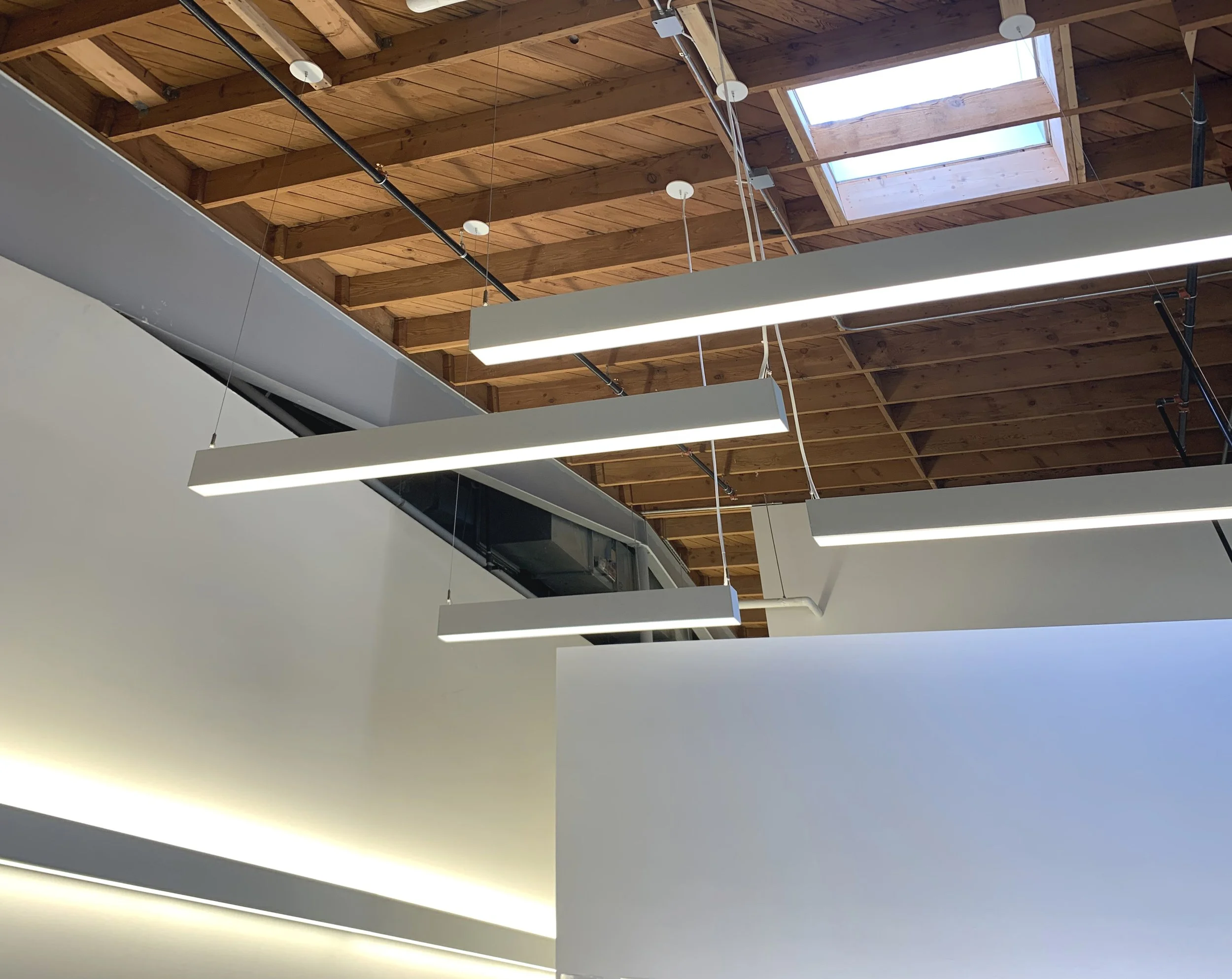
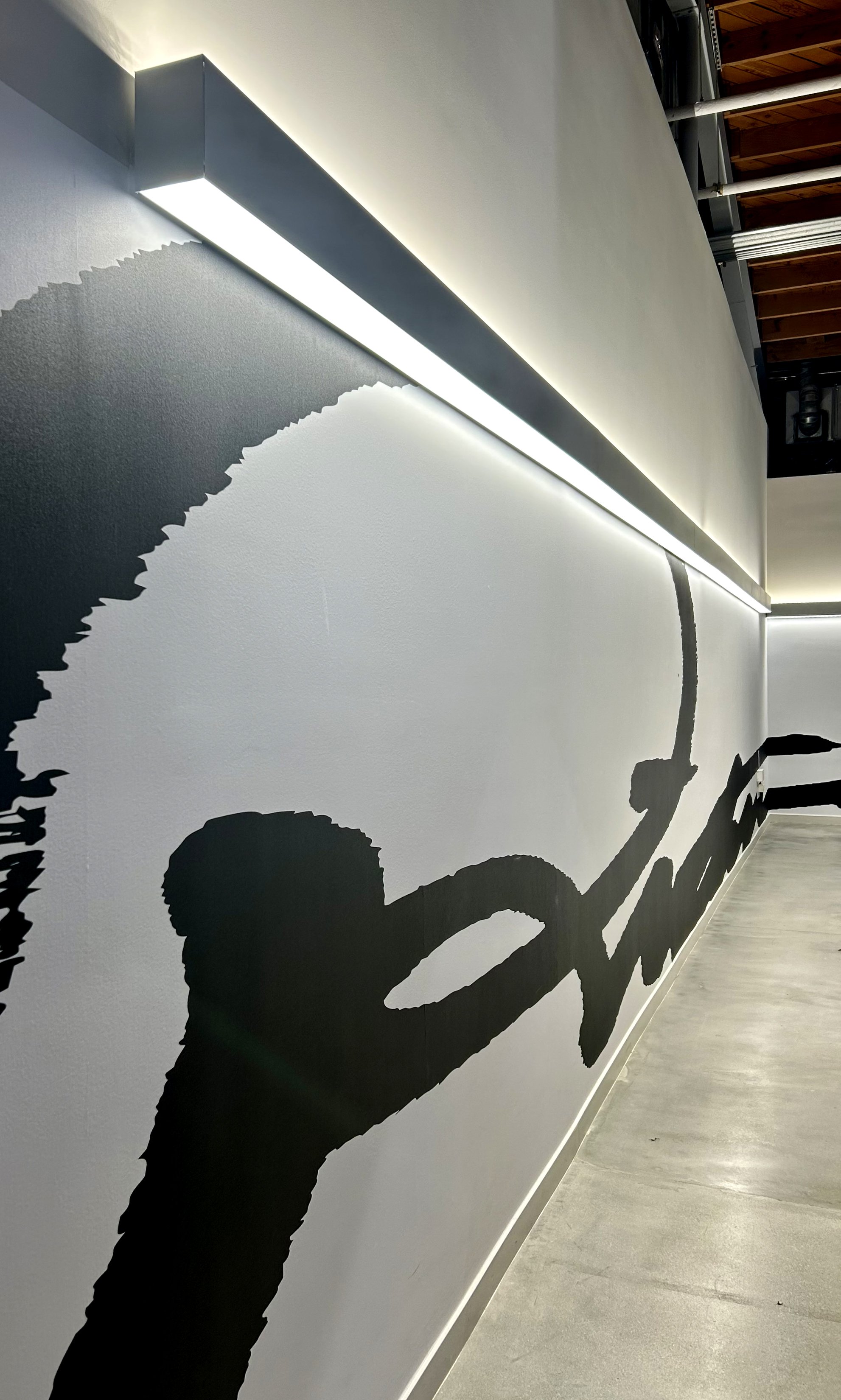
While the client loved the contemporary design of the exterior of the building, and the patterns of light inside formed by the windows, they also were looking for an interior that capitalized on the existing exposed brick and wood and would appear less corporate. The interior of the building maintains it’s raw and loft like qualities including full height exposed wood ceilings and polished concrete floors in the public areas. The central theater block walls are covered with a “secret” large format calligraphic message. It is only after repeatedly looking more carefully that the script reveals the words “Harbor Picture Company”.
In the restrooms, handmade, locally sourced, wallpapers with abstract patterns are used to create a sophisticated avant-garde aesthetic.


